Poster Maker - Flyer Creator
- 4.7
- Rating
- 10.00M
- Installs
- Free
- Price
 Analysis by App-foxy
When I need a quick visual for an event, sale, announcement, or social post, I usually do not want to open a full desktop design suite. I want something I can understand immediately, choose a suitable starting point for, and finish without spending an evening arranging boxes and text. Poster Maker - Flyer Creator is built around that exact moment: turning a phone into a practical poster-making workspace.
After using it as an Art & Design app, I found its main appeal less about artistic freedom and more about reducing the distance between an idea and a shareable graphic. It is made by ZipoApps, is free to start, and is suitable for Everyone. Its strong 4.7 average from around 65 thousand ratings and more than 10 million installs suggest that this straightforward approach has found a large audience, and I can understand why.
The important question is not whether it can replace professional design software. It cannot, and it does not need to. The better question is whether it helps an ordinary phone user produce a readable, attractive poster before the moment has passed. In my experience, the answer is often yes, especially when speed matters more than complete control.
You May Also Like

 AccuWeather: Weather Radar
AccuWeather Review: A Quick, Clear Forecast for Everyday Decisions
For everyday plans, the best forecast is the one you can understand quickly. AccuWeather makes rain timing, radar, and local conditions easy to act on, with a few trade-offs.

 Hill Climb Racing
Why Hill Climb Racing Still Turns Crashes Into One More Run
A tiny car, a bumpy hill and one more upgrade: Hill Climb Racing keeps resurfacing because its simple chaos makes every near-miss feel personal.

 AliExpress - Shopping App
AliExpress Makes Global Shopping Feel Personal, but Shoppers Bear the Risk
AliExpress turns a global marketplace into a pocket-sized discovery engine. Its reach is useful, its shopping loop compelling, and its trade-offs easy to miss.

 Lords Mobile: Kingdom Wars
Lords Mobile Is a Kingdom-Building Routine, Not a Quick Match
A case-by-case verdict on the building, battles, device demands, and social commitments that make Lords Mobile rewarding for some players and exhausting for others.

 PDF Scanner app - TapScanner
TapScanner Makes Paperwork Easier to Capture, Check, and Share
TapScanner makes scanning with a phone feel less like a rescue operation and more like a dependable step in getting work done. Its capture tools are useful, though not flawless.

 Block Blast!
 Shows How Much a Puzzle Game Can Leave Out
A quiet grid game shows why puzzle players increasingly value instant clarity, repeatable skill and low-pressure play—and where the genre still needs to catch up.
More From Our News Desk
View All News


Why the poster-first approach matters
The central capability here is fast poster creation. That sounds simple, but it changes the way I work. Instead of beginning with a blank canvas and wondering about dimensions, hierarchy, and decoration, I can begin with the purpose of the graphic. A flyer for a local class, a notice for a community group, or a promotional image for a small business all need different emphasis, yet they share the same basic challenge: the viewer should understand the message quickly.
This app is useful because it treats the poster as a communication object rather than just a picture. I can think first about the headline, supporting details, image, and call to action. That order prevents one of the most common mobile-design mistakes: spending too much time on colors and ornaments before deciding what the viewer actually needs to know.
I also like that the app fits short, practical sessions. If I am preparing a last-minute announcement, I do not need a long learning period. The interface is aimed at people who want to assemble a result rather than study design theory. That makes it approachable for students, club organizers, independent sellers, parents arranging an event, and anyone who has been asked to “make a quick flyer.”
There is a trade-off hidden in that convenience. A guided poster workflow can help me reach a polished result quickly, but it also encourages designs that begin from familiar visual patterns. If I want a completely unusual composition or precise brand control, I may find the structure limiting. The app’s greatest strength is also its boundary: it prioritizes a usable outcome over unlimited experimentation.
What I look for before editing
Before choosing a design, I decide where the finished graphic will be seen. A poster intended for a phone screen needs a different balance from one that will be printed or displayed at a distance. I keep the main message short, reserve a clear area for practical details, and choose an image that supports the subject instead of competing with the words.
This preparation makes the app feel more capable because I am not asking the editor to solve an unclear brief. A template or starting layout can organize information, but it cannot decide whether the event name matters more than the decorative background. I get better results when I write the essential copy first and remove anything that does not help someone decide what to do next.
One useful habit is to create the headline before adding secondary text. On a small screen, the headline is the first test of the design. If it needs several lines or becomes difficult to read over the image, I know the concept needs simplifying. This is a small workflow change, but it prevents the common problem of shrinking everything just to make all the original wording fit.
How the workflow feels in everyday use
The practical experience is based on selecting a starting design and adapting it to the message I have in mind. I can treat the initial arrangement as a framework rather than a finished product. The real work is replacing generic wording, choosing imagery that matches the subject, and making sure the final version still reads clearly after my changes.
I found it helpful to make one deliberate pass for content and another for appearance. During the first pass, I focus only on whether the title, date, location, offer, or contact information is present and understandable. During the second, I adjust the visual balance. Mixing both tasks at once often leads to unnecessary changes, particularly when I am working on a phone and the available editing space feels compact.
The app is especially convenient for users who do not want to build every element from zero. Starting with an arranged composition gives me a visual reference for spacing. It also shows how much information the design can comfortably hold. When I add too many details, the layout becomes crowded quickly, which is a useful warning rather than a flaw in itself.
For a realistic example, imagine that I am organizing a weekend neighborhood workshop. I would begin with the workshop name as the dominant text, then add the date and location in a quieter position. I would use one relevant image and keep the registration instruction easy to spot. After checking the design at a smaller viewing size, I would remove decorative text that does not help attendance. This workflow takes less effort than constructing the same announcement from an empty page.
That last check is important. A poster can look attractive while editing because I am viewing it closely, yet become confusing when reduced in a social feed or seen briefly on a phone. I judge the design by asking whether the main point is still obvious at a glance. If not, I simplify the wording or increase the contrast before considering the work complete.
Small decisions that improve the result
I recommend treating the background as support, not as the star. A busy photograph can make attractive text almost impossible to read, particularly when the image contains bright areas behind the headline. If the background is visually strong, I keep the wording shorter and place it over the calmest part of the image. If the message carries more importance than the photograph, I choose a quieter visual direction.
I also avoid filling every available space. Empty areas give the eye somewhere to rest and make the important information easier to find. This matters even more for flyers containing several practical details. A design that looks slightly sparse while editing may be much clearer once viewed as a small thumbnail.
Another useful approach is to make separate versions for separate audiences rather than forcing one poster to do everything. A public announcement may need the event name and date first, while a version for people who already know the event may emphasize a reminder or a registration instruction. Reusing the same basic idea while changing the hierarchy is often more effective than adding more words to one crowded design.
Because the app is free to download, it is easy to test this workflow without committing money at the beginning. However, “free” does not mean every part of the experience is necessarily cost-free. In-app purchases range from $0.99 to $279.99 per item, so I would check the purchase details carefully before selecting anything that appears locked or premium. That price range is a meaningful consideration for casual users who only need one occasional flyer.
The scenario where it makes the most sense
The strongest use case is a time-sensitive visual that needs to look intentional but does not require a design department. A small café announcing a temporary offer, a tutor promoting an open lesson, a student publicizing a club meeting, or a family preparing an invitation can all benefit from the quick poster workflow.
For a small business, consistency matters more than decoration. I would create a simple visual pattern with the same tone, wording style, and recognizable colors, then adapt the message for each announcement. Even if the app is not a complete brand-management system, this disciplined approach can make separate graphics feel related. The key is to make the business name and action clear before adding visual extras.
For a community organizer, the advantage is speed. Details often change close to an event, and a phone-based editor is convenient when I am away from a computer. I can revise the date, location, or instruction without rebuilding the whole announcement. That is a practical benefit that matters more than advanced artistic controls in this situation.
For a student, the app can help produce a presentation visual, event notice, or project announcement without requiring previous design experience. I would still advise checking school requirements before relying on a poster for formal work, especially if exact dimensions, print quality, or strict branding rules are involved. Fast creation is useful, but formal specifications may call for a more specialized tool.
For social media, I would use it when the goal is a clear single message rather than a complex campaign. A short announcement with one strong image can work well. A graphic containing a paragraph of information is less suitable because viewers may not stop long enough to read it. In that case, I would move the detail into the accompanying post and let the image act as the invitation to pay attention.
When another tool is the better choice
I would look elsewhere if I needed precise professional production, extensive layer management, advanced typography, or a carefully controlled identity system. A desktop design application is usually better for print projects that must meet exact specifications. A general-purpose online editor may also be preferable when I need broader collaboration, more elaborate layouts, or a large library of reusable brand assets.
I would also skip this app for projects that depend on original illustration or detailed photo manipulation. A poster creator is designed to assemble a communication piece efficiently, not to replace a drawing application or a full image editor. Trying to force it into that role could make the process more frustrating than starting with the right specialist tool.
It is less suitable for someone who enjoys building every visual element from scratch. The guided approach may feel restrictive if the pleasure of the project is experimentation. In that case, the app’s ready-made structure becomes a limitation rather than a shortcut.
Trade-offs I noticed before recommending it
The first trade-off is convenience versus originality. Starting from an organized design helps me avoid awkward spacing, but it can also lead to familiar-looking results. I can reduce that risk by changing the image, shortening the copy, and adjusting the emphasis instead of accepting the first arrangement unchanged.
The second is simplicity versus control. A less complicated editor is easier to learn, yet it may not provide the fine adjustment I expect from professional software. For a quick flyer, that is a fair exchange. For a print job where every margin and text position matters, it may become a real obstacle.
The third is free access versus optional spending. Since the app is free, it is approachable for experimentation, but the in-app purchase range means I should not assume that every asset or editing choice is included. I would decide the maximum I am willing to spend before browsing paid options, particularly if I am making a one-off design rather than producing posters regularly.
There is also a quality-control trade-off. A template can make a weak message look more finished, which may tempt me to stop editing too soon. I still need to proofread names, times, addresses, and calls to action. A visually polished mistake is more dangerous than an obviously unfinished draft because people may trust it.
Device compatibility is straightforward for many users because the app supports Android from version 8.0 onward. I would still consider the age and performance of a particular phone before expecting a smooth editing session, especially when working with image-heavy designs. The listed current version is 1.4.4, so I would keep the app updated through the normal platform process when possible.
Questions I would answer before installing
If you are wondering whether you need design experience, I would say no for the app’s intended quick-poster workflow. You will still make better graphics if you understand basic hierarchy, contrast, and concise writing, but the starting structure lowers the technical barrier.
If you are asking whether it is useful for business, my answer depends on the business. It is a sensible option for occasional promotions and local announcements. I would be more cautious for a company that needs strict brand consistency across many formats, because a dedicated brand-oriented workflow may offer better control.
If you only need one poster, the free entry point makes trying it reasonable, but I would inspect any paid selection before confirming a purchase. The presence of in-app purchases means the most convenient or distinctive option may not be included in the no-cost experience.
If you are concerned about age suitability, the Everyone rating makes it broadly accessible. That does not remove the need for adult judgment when the app is used by children for public announcements or when a design includes personal contact details.
If you are deciding between this and a full design suite, I would choose this app for speed and choose the larger tool for precision. The right choice depends on whether the hardest part is starting the design or controlling every last detail. For me, the former is where Poster Maker - Flyer Creator earns its place.
Who gets the most value from it
I think the best audience is the practical creator: someone who needs a poster today, works mainly from a phone, and values a clear result over a deep professional toolkit. The app can also suit beginners who feel blocked by blank canvases. Its guided approach gives them a starting point and makes it easier to learn by adjusting an existing composition.
It is particularly helpful for people who repeat similar communication tasks. A tutor may need several class announcements, a club may promote recurring meetings, and a small seller may prepare occasional offer graphics. In each case, the time saved by beginning with a structured design can outweigh the limits in customization.
I would not recommend it as the only design tool for a professional designer, a print specialist, or anyone managing a demanding visual identity. Those users may quickly run into the boundaries of a mobile poster-focused editor. I would also hesitate to recommend it to someone who dislikes template-led work or wants complete control over original layouts.
My final view is positive, with sensible expectations. This is a fast communication tool, not a replacement for a full creative studio. When I keep the message short, give the headline room, check the design at a small size, and treat paid options carefully, it helps me produce a credible flyer without unnecessary effort.
Released on November 7, 2019, and now at version 1.4.4, the app has had time to establish a clear identity around accessible poster creation. Its free starting point, Everyone rating, and large user base make it easy to consider, but the real reason I would recommend it is narrower and more useful: it helps turn a specific announcement into a readable visual before I lose momentum.
Poster Maker - Flyer Creator is worth trying when your priority is getting a presentable poster finished on a phone. I would use it for local events, simple promotions, reminders, and quick social graphics. I would move to a more advanced alternative when exact production control, collaboration, or a distinctive custom layout becomes more important than speed.
FAQs for Poster Maker - Flyer Creator
01What is Poster Maker - Flyer Creator used for?
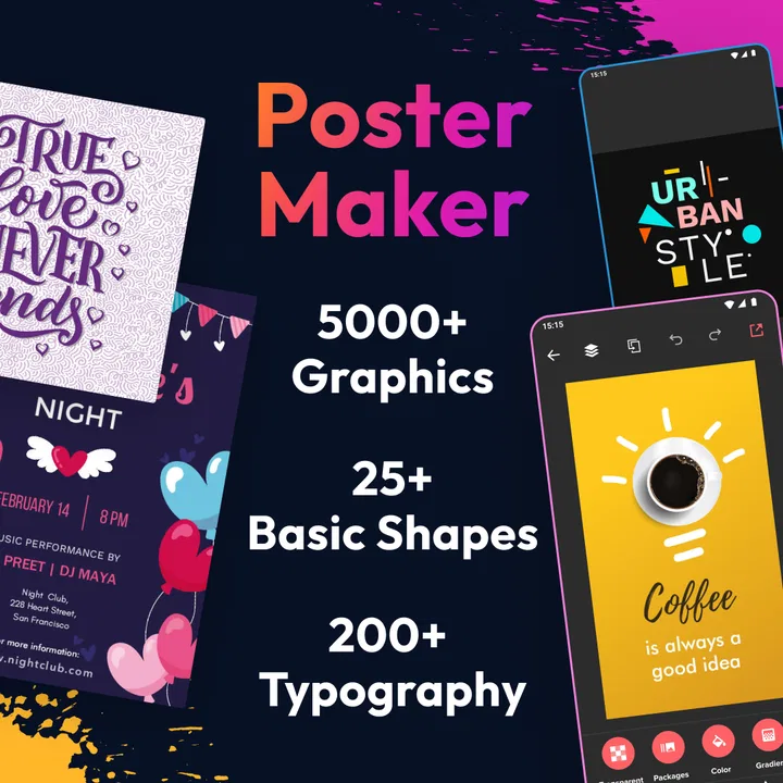
Poster Maker - Flyer Creator is a mobile design app for creating posters, flyers, invitations, banners, advertisements, social media graphics, and promotional images. It typically combines ready-made templates, customizable text, backgrounds, stickers, shapes, and image tools, allowing users to produce designs directly from an Android or iOS device without needing advanced graphic design experience.
02Is Poster Maker - Flyer Creator easy to use for beginners?
Yes, the app is generally designed with beginners in mind. You can start with a template or create a design from a blank canvas, then tap individual elements to change their position, size, color, font, or content. The interface is more approachable than professional desktop software, although creating a polished result may still require some experimentation with alignment, spacing, and readable typography.
03Can I create designs without an internet connection?
Some features may work offline, especially if the application and its basic assets are already installed on your device. However, online access may be required for downloading additional templates, fonts, stickers, stock images, or other design resources. Internet availability can also affect advertisements, cloud features, and sharing options, so offline functionality may vary depending on the app version and device.
04Can finished posters and flyers be saved or shared in high quality?
Poster Maker - Flyer Creator usually allows completed designs to be saved to the device and shared through messaging apps, email, social networks, or other installed services. Export quality and available file formats can depend on the selected design, application version, and whether a premium plan is active. Before printing, check the resolution and dimensions to ensure the result is suitable for the intended use.
05Is Poster Maker - Flyer Creator free to download and use?
The application may be available as a free download, but free access can include advertisements, locked templates, watermarks, limited export options, or restrictions on certain creative tools. Optional in-app purchases or subscriptions may unlock premium resources and remove some limitations. It is worth reviewing the store listing and subscription terms before downloading, particularly if you only need the app for occasional personal projects.
Pros
- Large template library for posters
- flyers
- and social media graphics.
- Simple drag-and-drop editor suitable for beginners.
- Supports custom images
- text
- colors
- fonts
- and backgrounds.
- Useful export options for sharing designs across social platforms.
- Works well for quick promotional materials without design experience.
Cons
- Some templates and design elements require a paid subscription.
- Free exports may include watermarks or lower-quality limitations.
- Advanced typography and layout controls are relatively limited.
- The app may feel slow when editing complex
- image-heavy designs.
- Frequent promotional prompts can interrupt the creative workflow.

Poster Maker - Flyer Creator
Gallery